





Did you know that there is a system that helps you understand how colors combine and interact with each other? It’s called the color wheel itten, and it’s a tool that designers need to choose the right color palette for their work.
What is the Color Wheel?
The Itten color wheel is a graphical representation of colors on a pie chart developed by Johann Wolfgang von Itten, a Swiss artist and educator. It is based on a theory of color that includes three primary colors – red, yellow, and blue – and their combinations to form other shades.
The Itten Circle consists of three main sectors representing the primary colors, three secondary colors that are formed from combinations of the primary colors, and six tertiary (also known as intermediate) colors that result from mixing the primary and secondary colors.

Colors on the color wheel
- Yellow
- Green
- Blue
- Violet
- Red
- Orange
Why do you need the Itten circle?
Color perception is always based on the fact that we perceive more than just what we see. Even when an additional color is not actually present, our eye almost automatically adds it to provide a sense of completeness.
Thus, Itten’s Circle helps you to quickly and efficiently select harmonious color combinations or contrasts. It provides a visual system for understanding the relationships between colors, allowing you to create harmonious images with ease.
- Using the Itten color wheel helps to create not only professionally competent but also aesthetically pleasing products such as websites, promotional materials, artwork, and more.
- Proper use of color can enhance the emotional and psychological state of the audience. The use of harmonious color combinations can lead to positive emotions and contribute to a better perception of a product or service.
- In web design and other visual projects, the right colors can increase website traffic. Itten’s Circle helps you choose colors that promote usability, readability, and user engagement.
Read also: How to save a YouTube video?
How to use the color wheel?
To use the Itten color wheel, you need to follow a few simple steps. First, determine the primary color you want to start with. Then, look at its location on the wheel and find out which colors are its counterparts. After that, choose the right color accent and use it to create a harmonious or contrasting combination.
The main colors on the Itten circle are red, yellow, and blue. Because these colors form the basis for the entire spectrum, they are the starting points for the formation of other colors.
Adding additional colors forms a two-color harmony consisting of the most contrasting shades. In art, these combinations are used to create particularly vivid images. The most distant pairs of colors provide a bright but soft combination, while adjacent and similar colors complement each other, maintaining harmony and creating a sense of fullness.
The triad combination starts with similar shades that do not create contrast. The classic and contrasting triads are formed on the principle of a triangle, with an acute-angled triangle providing the most effective combinations, and an equilateral triangle providing the most balanced ones. There are four types of four-color combinations, with contrasting harmony providing bright combinations and classical harmony providing softer but more complete shades. Square and rectangular harmonies provide an even softer palette of shades. The six-color harmony, formed by an equilateral hexagon, opens up opportunities for creating interesting compositions.
Read also:
Color schemes on the itten circle
There are six basic color combinations on the Itten circle.
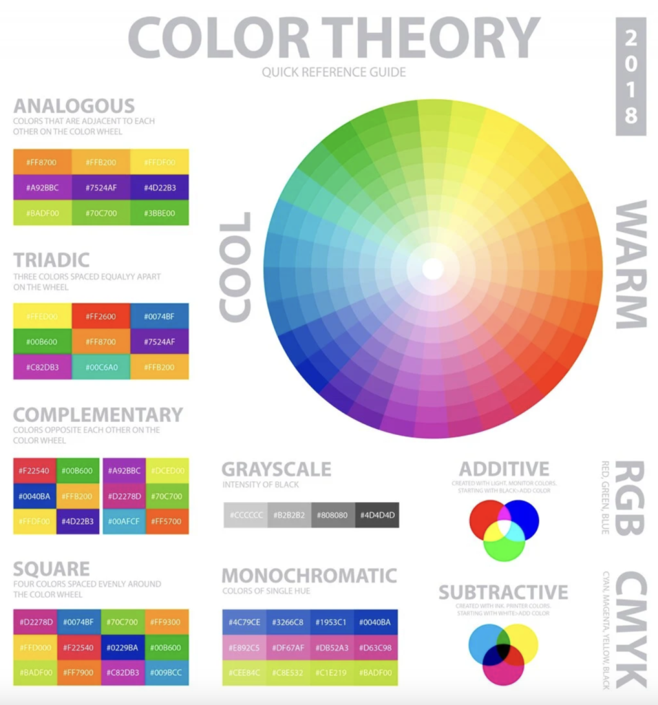
The first of them is a complementary scheme, where colors located opposite each other on the circle create a contrast. For example, red and green. These combinations are not recommended to be used in equal proportions, but are well suited for emphasis when one color prevails over the other.
The classic triad, the second variation, is formed by drawing an equilateral triangle on a circle with the vertices representing the three colors. This allows you to create a soft contrast by choosing a bright and two muted colors.
A similar scheme, the third variation, uses three to five colors that are placed side by side on the circle, creating a restrained and elegant combination.
The rectangular scheme, the fourth variation, is created by inscribing a rectangle in a circle where every two colors are complementary, providing an interesting and soft contrast.
The square scheme, the fifth variation, is based on four colors equidistant from each other on the circle and uses two pairs of complementary colors.
Each variation of the color scheme on the Itten circle has its own specifics and can create a variety of effects in interior design.
Thus, the Itten circle is an important tool for understanding color and its relationship. It helps artists and designers develop color palettes, choose harmonious colors for different projects, and understand which colors work best together.
Read also: High-level programming languages




Leave a comment